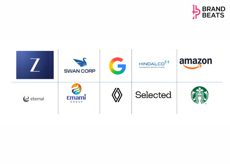
If 2024 was about digital acceleration, 2025 became the year of brand reinvention. From conglomerates to lifestyle leaders, Indian brands embraced bold logo redesigns to signal
transformation, connect with younger audiences, and stay relevant in a fast-evolving market. These changes weren’t just cosmetic, they reflected purpose, innovation, and cultural resonance.
Here’s a look at 10 brands that made headlines with their fresh identities this year and what it means for the future of advertising and design.
1. Zee Entertainment
Zee rolled out a mega rebrand, replacing its iconic circular logos with a stylized letter Z across channels. This unified identity reflects Zee’s ambition to be a modern, tech-driven media network,ready for the streaming era and global content partnerships.

2. Zomato (Eternal)
Zomato rebranded its corporate identity to Eternal, signaling its expansion beyond food delivery into tech, commerce, and lifestyle ecosystems. The new logo reflects ambition, versatility, and futuristic thinking, positioning Zomato as a multi-sector innovator.
3. Emami
Emami introduced a sleeker, contemporary logo while retaining its heritage cues, reflecting its ambition to blend tradition with innovation in the personal care and wellness space.
4. Swan Corp
Formerly Swan Energy, Swan Corp introduced a stylized swan in upward motion, symbolizing progress, resilience, and diversification into shipbuilding, and heavy industries. This rebrand positions Swan Corp as a strategic player in India’s industrial renaissance.
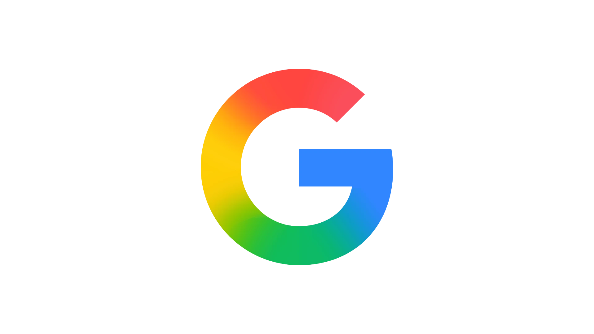
5. Google
Google softened its iconic G with smooth gradients and rounded edges, aligning with AI-driven branding aesthetics and digital adaptability. The redesign reflects Google’s commitment to simplicity and futuristic design language.
6. Renault
Renault unveiled a streamlined, flat logo that emphasizes modernity and electric mobility. This move aligns with global automotive trends and Renault’s push toward sustainability and tech innovation.

7. Hindalco
Hindalco refreshed its identity with cleaner lines and a contemporary color palette, signaling its evolution from a traditional metals giant to a sustainability-focused, innovation-driven enterprise.

8. Selected
Selected, a premium fashion brand, introduced a minimalist wordmark with bold typography, reflecting
sophistication and digital-first retail strategies aimed at younger, style-conscious consumers.

9. Amazon
Amazon tweaked its iconic smile logo with a deeper curve and vibrant orange, signaling warmth, approachability, and customer-centricity. The redesign aligns with Amazon’s global strategy to humanize its tech-driven ecosystem.

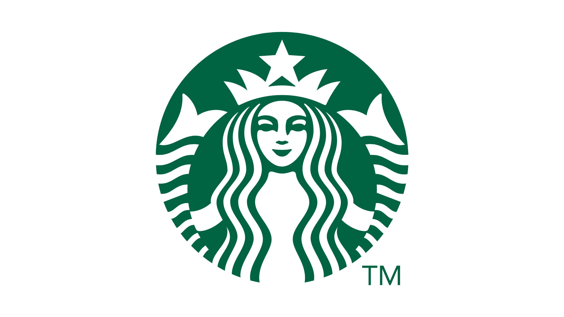
10. Starbucks
Starbucks further simplified its siren logo, optimizing it for digital platforms and global recognition. The refresh underscores Starbucks’ commitment to consistency and adaptability in a mobile-first world.
These redesigns underscore a powerful trend which indicates that branding is storytelling. Logos today are not static; they’re dynamic signals of evolution, purpose, and consumer connection. For advertisers and marketers, these moves offer lessons in how design drives perception and loyalty.

