When it comes to brands we just can’t quit, their packaging isn’t just a wrapper it’s basically a whole personality shouting, ‘Hey, pick me!’ Think about it: that unmistakable royal purple of Cadbury Dairy Milk or the bright yellow of Maggi noodles. They’re not just snacks, they’re comfort, nostalgia, and a little bit of magic wrapped up and ready to go. These brands have been sneaking into our lives for decades, rocking colours and designs that make us reach out before we even think twice.
But wait, there’s more. Kit Kat’s classic ‘Have a Break’ vibe got a sleek makeover too. Meanwhile, Glow & Lovely dropped the ‘fair’ and picked up a whole new packaging overhaul.
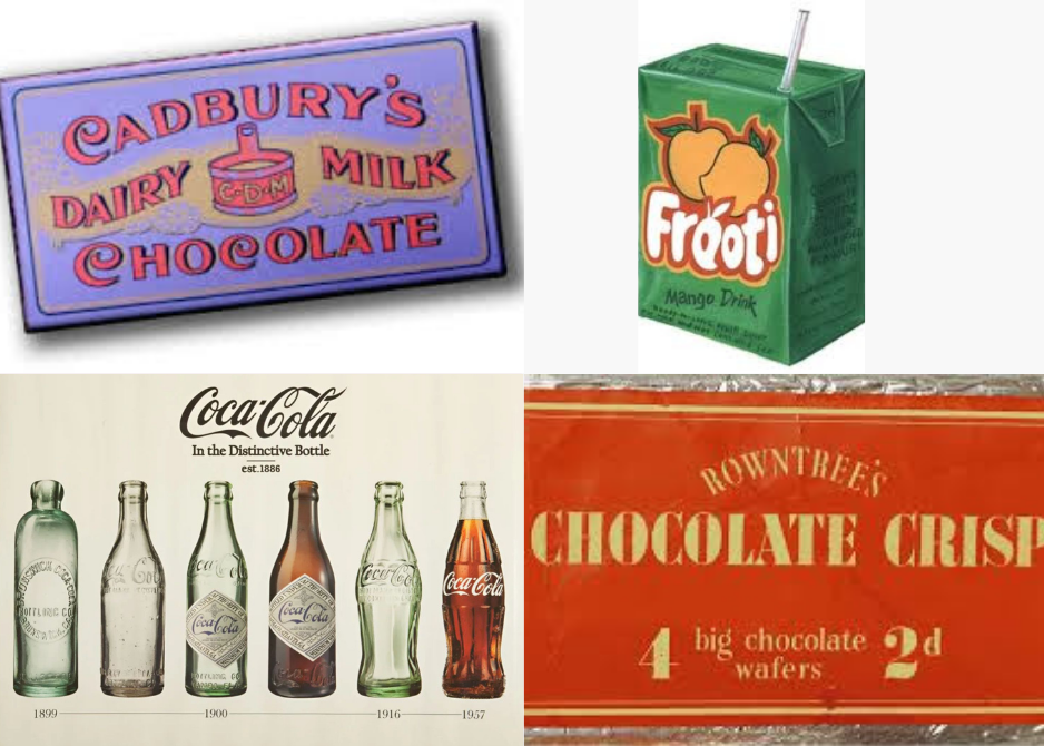
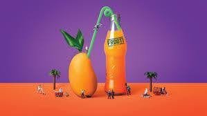
Frooti’s mango-packed punch and Coca-Cola’s curvy bottle swagger prove that packaging isn’t just about looking good on shelves, it’s about telling stories, sparking smiles, and keeping things fresh and fun.
So get ready to unwrap some seriously cool tales behind those wrappers and boxes. Because when brands bring their A-game to packaging, every bite, sip, or snap turns into a little celebration and honestly, who doesn’t love a party in their snack stash?
Cadbury Dairy Milk
Every time you crave chocolate be it post-breakup blues or late-night sweet tooth, your hand instinctively reaches for that iconic purple wrapper. You don’t check the name, price, or logo. You just know it’s Cadbury Dairy Milk. That’s how deep it’s engraved in our hearts.
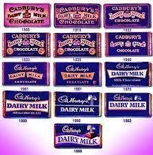
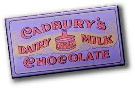
It all began over a century ago, when Cadbury launched a simple, creamy chocolate bar in the UK with no drama, no frills, just pure indulgence. Soon after, that iconic purple wrapper was introduced, adding a royal touch that came to symbolise richness, warmth, and comfort.
When Dairy Milk made its way to India in the late 1940s, it didn’t just grab market share it grabbed hearts. From school tiffins to Diwali gifts, it slowly melted its way into our lives, becoming more than just chocolate it became a feeling.
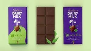
But as the world got more Insta-savvy, Cadbury’s packaging started to look a little ummm, stuck in the ’90s. Still iconic, but in need of a glow-up. So in 2020, the brand partnered to give itself a sleek, emotional upgrade. The result? A deeper, more digital-friendly purple, a flowing Glass & a Half milk logo finally doing its job, and a handwritten logo inspired by John Cadbury’s actual signature. Subtle, yet powerful.
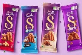
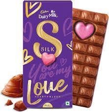
Cadbury didn’t stop there. Variants like Crackle, Fruit & Nut, and Roast Almond got playful, personality-packed wrappers. And Silk? It got the royal treatment. In 2022, the diva debuted her golden ‘S for Love’ engraved on both the wrapper and the chocolate cubes. Love never looked (or tasted) so good. Right?
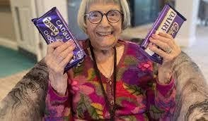
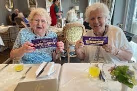
Then came the chef’s kiss moment in 2024, the 200th anniversary. Cadbury dropped Memory Bar Boxes for dementia care homes, wrapped in vintage designs from different eras. Not just a marketing move, a reminder that packaging can spark joy, comfort, and connection that connects deeply.
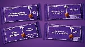
And just when we thought Cadbury had done it all, they surprised us again. The bars came with their ‘Made to Share’ edition playful wrappers that turned every bite into a little moment, like ‘Who picked the playlist?’ or ‘Who made the tea?’ Sharing suddenly felt a lot more fun. Then came the Summer Edition bars with heat-sensitive wrappers that revealed beachy designs when chilled umbrellas, deck chairs, the works and the new Iced Latte flavour? Like a mini vacation in every bite.
Even better? Cadbury made it green. Bars were now wrapped in recycled plastic, cutting down hundreds of tonnes of waste proving that even the sweetest treats can care for the planet.
From vintage tins to temperature-activated wrappers, from handwritten signatures to shareable segments, Cadbury Dairy Milk’s packaging journey is more than a rebrand; it’s a love story. One that has grown with us, adapted to our moods, and stayed just familiar enough to feel like home. The wrapper may evolve, but that first instinct to reach for the purple stays deliciously the same.
Frooti
Back in the day, when the sun showed no mercy and you needed a drink that screamed summer, your hand went straight for that green-and-yellow drink chilling in the supermarket fridge practically yelling, ‘Hey, I’m Frooti, pick me!’ Launched in 1985 as India’s first tetra-packed mango drink, Frooti wasn’t just juice, it was mango magic, boxed.
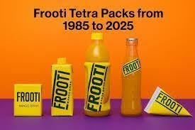
But as the world got cooler, trendier, and full of flashy new thirst-traps in bottles and cans, Frooti knew it had to glow up. That nostalgic box was iconic, sure but it was starting to look like it hadn’t updated its wardrobe. So, it ditched the dated look and went full-on fab with bold mango splashes, playful fonts, and packs that practically shouted ‘cool kid energy.’ Then came sleeker pet bottles, limited editions with cricket & Bollywood swag, and vibrant festival-themed packs that turned every sip into a cultural moment.

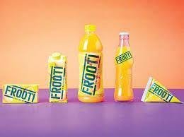
By 2019, it wasn’t just about looking fresh it was thinking fresh too. Frooti slimmed down its packaging weight and amped up recyclability to go greener (and cooler). Social media campaigns hit hard, especially with Gen Z who loved the retro-meets-quirky vibes.
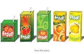

And guess what? Even with all the flashy new brands entering the mango wars, Frooti’s still killing it pouring nostalgia, freshness, and pure mango chaos into every box. The pack’s grown sleeker and smarter but that first sip? Still the same.
Coca-Cola
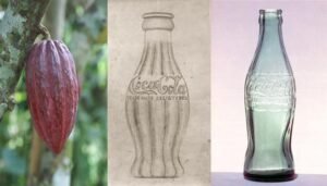
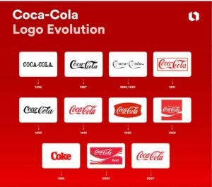
Coca-Cola’s journey began not with a bottle, but with a syrup. In 1886, it was served at a small pharmacy in the U.S., poured straight from a soda fountain. There were no fancy labels or bottles back then just a refreshing, fizzy drink that people loved. As its popularity grew, others started trying to copy it, creating similar-looking drinks in similar bottles. That’s when Coca-Cola realised it needed something more than just great taste, it needed a look that was unique and impossible to copy.
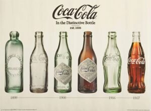
That’s how the famous Coca-Cola bottle was born. In 1915, the brand introduced its curvy glass bottle, inspired by the shape of a cocoa pod. It was made to be instantly recognisable even in the dark or if broken. That bottle became more than just packaging it became a symbol. You didn’t need to see the label to know it was Coca-Cola. Over time, other things became part of its identity too like the flowing white logo written in beautiful cursive, and the bright red colour that still stands out on shelves today.
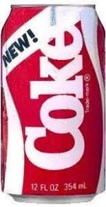
But like every long journey, there were some bumps on the road. In the 1980s, Coca-Cola tried changing its taste and branding with something called ‘New Coke.’But people didn’t like it at all. The company quickly brought back the original taste, showing that some things are better left the way they are. Since then, Coca-Cola has found ways to stay fresh and modern, without losing its charm. It updated its packaging, made its bottles lighter and more eco-friendly, and even made the red colour bolder and more attractive.
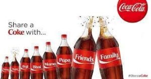
One of the most loved ideas came with the ‘Share a Coke’ campaign, where bottles had names, nicknames, and fun words printed on them. It made buying a Coke feel more personal and special like it was meant just for you. For many, it brought smiles, memories, and moments worth sharing.
From being a simple fountain drink to becoming one of the most recognisable brands in the world, Coca-Cola has shown that with good taste, thoughtful design, and a bit of fizz, you don’t just make a drink you create a legacy.
Glow & Lovely
We’ve all seen people with darker skin tones being told, either directly or subtly, that fairer skin is somehow better. Maybe it was a family member, a neighbour, or someone from school who said, ‘Dark skin is ugly’or worse, ‘Who will marry you if you stay this dark?’ These words stick. And so begins the cycle experimenting with endless beauty products, home remedies, and fairness hacks, all in the hope of becoming lighter. For many dark-skinned girls, this wasn’t just about skin it was about self-worth.

They were made to feel objectified, constantly compared, and slowly, their confidence chipped away. Then came the ultimate giant solution of creams like Fair & Lovely. For years, it was marketed as a best friend offering fairness as a ticket to beauty, success, and even marriage. Because for decades, fairness wasn’t just a preference it was seen as the standard of beauty. The name said it all: be ‘fair’ and you’ll be ‘lovely.’ For years, the cream sold dreams as much as it sold tubes.
As the world moved, so did the questions and awareness about skin tones and body positivity. Fast-forward to the 2010s, globally and locally, conversations around beauty were shifting. Skin tone wasn’t just a beauty topic, it was a social one.

People started calling out colourism, questioning why a cream was suggesting fair skin was the ideal. In 2020, things reached a tipping point. Movements like Black Lives Matter had ripple effects across the world, and beauty brands everywhere were being held accountable. Fair & Lovely faced major backlash online, especially from Indian youth who were more vocal than ever about self-acceptance and inclusivity.
The brand realised what its audience wanted and something had to be changed if they wanted to be a favourable player. Hindustan Unilever responded in June 2020, that Fair & Lovely would be rebranded to Glow & Lovely. The word ‘fair’ which was seen as derogately was dropped entirely.

The brand said it wanted to celebrate radiant, healthy skin of all tones. It wasn’t just a name change either. Packaging, advertising, and product messaging got a glow-up too.
So, while Fair & Lovely might have once ruled the market with its fairness pitch, Glow & Lovely is trying to rewrite that story with a new name, a new message, and the hope of a more inclusive future. Whether the audience buys into it long-term? That’s still unfolding. But the rebrand itself? A glow-up rooted in the power of changing minds and marketing.


Kit Kat
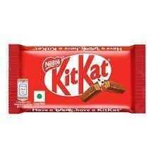
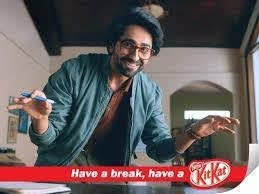
You know you need a little calm before the chaos. Whether it was a post-exam treat, something you sneak during a boring lecture, something you need during your emotional breakdown after getting scolded at work or that go-to bar at your neighbourhood kirana store, ‘Have a break, have a Kit Kat’ became a full-on vibe.
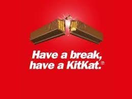
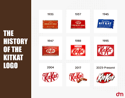
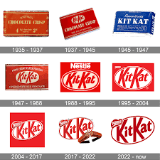
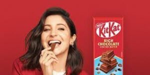
But in 2024, Kit Kat decided it was time for a bit of a makeover. Not the new recipe kinda, don’t worry, the crunch is safe, but a proper visual glow-up. The U.S. version of the brand got a bolder, chunkier logo cleaner, tighter, and way more eye-catching. Gone were the soft shadows and stretched letters, came sharper fonts and a white outline that made the classic red pack pop like never before. It was still recognisably Kit Kat, but with a lot more confidence like your long lost school friend who came back from abroad all stylish and sorted.
Fast-forward to now, and they’re going full throttle with a Formula 1 sponsorship starting in 2025. Imagine race cars zooming around with Kit Kat branding, yep, the same chocolate bar you munch on during traffic jams will now be seen on F1 tracks worldwide.


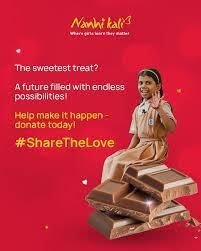
Now, over here in India, Kit Kat didn’t go for a dramatic rebrand. Instead, it did something even more thoughtful. In 2016, it dropped its famous ‘Have a break’ tagline and even removed the iconic snap from the bar to say something bigger: ‘No Break from Education,’ supporting girl child education with Project Nanhi Kali.
During the pandemic, the wrapper got a tiny face mask printed over the logo turning packaging into a public health message. So while the look stayed familiar, Kit Kat in India proved that sometimes, the most powerful changes aren’t flashy, they’re meaningful Just like quiet rebranding, loud impact.

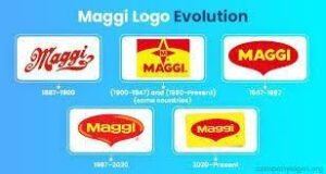
Maggi
You know there are few tastes that become home, whether you are a hosteller living in India, a student living abroad or just someone surviving office life, Maggi was always just two minutes and one pan away. But then came that year 2015 when India’s favourite comfort food suddenly disappeared from shelves. Why? Because Maggi got caught in a storm allegations of excessive lead and MSG. Panic spread, bans followed, and in no time, the yellow packs vanished.

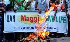
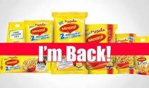
People were heartbroken. Not just because they lost noodles, but because they lost memories of midnight snack fights with siblings regarding who would get the most part, rain-day cravings, mum’s quick fixes after a heartbreak but instead of crumbling under the weight of controversy, Maggi did something rare. It paused, took a breath, and came back stronger.
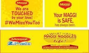
Nestlé India worked behind the scenes testing, retesting, proving compliance, and rebuilding trust. But they didn’t just wait for the legal green light. They connected with people. The comeback was emotional. There were open letters, clever campaigns, even a comeback anthem Maggi didn’t just return to stores, it returned to hearts. Within months, Maggi reclaimed its market share and that’s not just a comeback. That’s a mic drop.
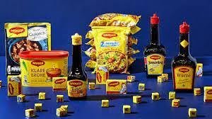
Soon we saw the shelves displayed with masala cubes, sauces, recipe kits making its way into daily meals, not just snack breaks.
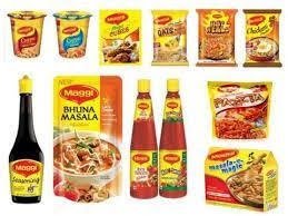
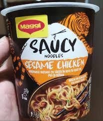
And the packaging? That got a glow-up too. Especially with products like Maggi Saucy Noodles darker, spicier-looking packs, bold fonts, glossy ingredient shots, even a dragon or two on theAsian-inspired range. No confusion, no soupiness, just saucy noodles with serious shell appeal. It was modern, clear, and built for the aesthetic Gen Z ‘s.
So while Maggi never lost its soul, it did something brilliant and reinvented its role. From ‘just noodles’ to a kitchen essential. From crisis to connection. From comfort food to a culturally rooted brand that understood its audience wasn’t just hungry for food but for honesty, warmth, and a little reinvention.


