Logos show up in our lives with the same chaotic confidence as a kid who bursts into a room uninvited loud, bold, and fully convinced the world revolves around them. But here’s the plot twist: some of the most famous ones are hiding secrets like they’re playing a permanent game of peekaboo.
Designers, of course, love this sneaky business. They tuck symbols, stories, and optical illusions into logos the way kids hide candy proudly, cleverly, and fully expecting you not to notice. A bit of negative space here, a heritage nod there, maybe even a secret chocolate silhouette (yes, Hershey’s, we see you). It’s branding with mischief baked in, and honestly, it’s delightful.
And the funniest part? Once someone points out these tiny surprises, your brain refuses to go back. Suddenly FedEx trucks feel smug, Amazon packages look like they’re in on a joke, and that Baskin Robbins “31” pops out like it’s been waiting years for you to pay attention.
So let’s dive into the logos that have been messing with our eyes, our minds, and maybe even our pride because these hidden messages have been right in front of us the whole time.
FedEx – The Sneaky Arrow That Outsmarted Your Eye
FedEx, the superhero of speedy deliveries parcels, urgent gifts, you name it. But here’s a little secret most of us totally missed: the logo has a tiny arrow hiding between the “E” and the “x,” quietly doing stealthy brand work without anyone noticing.
FedEx’s logo journey is a story of transformation and sneaky genius. It kicked off in 1973 as Federal Express, looking formal, serious, and, let’s be honest, a bit corporate-y. By 1994, designer Lindon Leader swooped in, shortening the name to FedEx and slipping in that clever arrow using negative space. Speed, precision, forward motion all without shouting.
Since then, colours changed by service: orange and purple for Express, green for Ground, blue for Freight. That hidden arrow? Our brains see it as forward motion, subliminally whispering: “Fast. Reliable. On time.” Like a ninja courier sneaking packages into your life.
The arrow is so sneaky, you could stare at a FedEx package for a solid 10 seconds (or longer) before it clicks. It’s like finally finding the last piece of a puzzle you’ve been staring at since childhood satisfying, surprising, and a little smug-making.
FedEx proves that even the tiniest detail can steal the show. A hidden arrow, a ninja courier vibe, and a pinch of design magic turned a plain logo into a secret handshake with your brain all while making sure your packages arrive on time. Who knew logistics could be this sneaky and this stylish?
Amazon – The A-to-Z Smile That’s Been Staring at You for Years
Amazon, the modern genie of the internet, somehow ships a phone case, cat food, a ring light, and a screwdriver to your doorstep in one suspiciously light box and somehow does it before you’ve even remembered you ordered them. But here’s the part most people never notice: that curved yellow swoosh under the name isn’t just a friendly grin. It’s actually an arrow pointing from A to Z, quietly flexing that Amazon sells almost everything the alphabet can produce. Hidden meaning? Absolutely. Noticeable? Not until someone points it out.
The logo’s glow-up story begins in 1998, when Amazon was still an earnest online bookstore figuring out its aesthetic. By 2000, the Turner Duckworth design team swooped in and introduced the now-iconic arrow not just as decoration, but as a visual mic drop for Jeff Bezos’ ambitions. A store for everything became more than a pitch; it became part of the logo’s DNA.
And the smile? That was intentional too. Amazon’s research showed that curved shapes make shoppers subconsciously trust a brand. Essentially, it’s a smile designed to boost both your serotonin and your spending.
Over the years, the font sharpened, the orange brightened, and the arrow-smile combo quietly became the unofficial mascot of impulse buying. The funniest part? Millions of people see the logo daily on boxes, emails, apps, and Prime packages without ever realizing they’ve been staring at a built-in alphabet flex.
Amazon’s logo proves that sometimes the smartest design trick is the one that whispers instead of shouts: a secret smile, a letter-to-letter flex, and a splash of design wizardry. It’s basically a wink from a brand that already knows it has exactly what you’re looking for.

Baskin Robbins – The Logo That’s Literally Serving You a Scoop of Math
Baskin Robbins isn’t just the place where you panic-choose between Rocky Road and Jamoca Almond Fudge; its logo is hiding a sweet little secret right in your face. Look closely at the bright pink parts of the “BR” and you’ll spot the number 31 tucked inside, like a dessert Easter egg.
That number isn’t random; it’s a throwback to the brand’s original promise from the 1950s: 31 flavours, one for every day of the month. Basically, a calendar you can eat. The logo got this clever upgrade in 2005, when the design team at Carson/Roberts decided to fold the brand’s heritage directly into the letters.
Instead of slapping “31 flavours” underneath the name, they baked it into the logo itself subtle, smart, and sweet enough to make every designer nod in approval. And while Baskin Robbins has way more flavours now, the “31” stays as a little wink to its roots.
Most people see the bright colours and bubbly font and think “ice cream,” but once the hidden 31 pops out at you, you’ll never unsee it. It’s the branding equivalent of finding an extra scoop at the bottom of your cone unexpected, delightful, and absolutely on brand.

Hershey’s Kisses – The Logo That’s Hiding a Kiss Right Under Your Nose
Hershey’s Kisses have always been about sweet little surprises, but the biggest surprise isn’t even inside the wrapper it’s hidden in the logo. If you tilt your head (or just pay attention for once), you’ll spot a sideways Hershey’s Kiss tucked between the “K” and the “I.” Not a trick of the eye, an actual, intentional chocolate silhouette planted there by Hershey. It’s like the brand left a little treat for anyone curious enough to look closely.
Why’d they do it? Simple: Hershey wanted the logo to quietly celebrate its most iconic candy without turning the wordmark into a cartoon. The negative-space Kiss became a subtle tribute to the classic chocolate that’s been around since 1907, complete with the trademark plume that made it one of the first candies to ever have branded packaging. (Fun fact: that little paper plume is officially called a “plume” and Hershey trademarked it in 1921.)
The clever hidden Kiss is one of those branding moments that rewards anyone who pays attention. You stare at the logo for years, thinking it’s just blocky letters, and then boom a chocolate-shaped “aha!” moment hits you. Suddenly, the brand feels a little smarter, a little sweeter, and maybe even a little smug.
Unilever – The “U” That’s Sneakily Showing Off
Think a single letter can hold a whole empire? Meet Unilever’s “U” bold, friendly, and secretly stuffed with over 25 tiny treasures. There’s a spoon for food, an ice cream swirl for treats, a flower for beauty, a sparkle for cleanliness, a hand for care, a bee for nature, a recycling symbol for sustainability, and a heart for health. Each icon is a nod to one of Unilever’s 400+ brands, turning that innocent-looking “U” into a mini encyclopedia of everything they stand for.
Designed in 2004 by Wolff Olins, it’s clever, cohesive, and playful like a wink in logo form. Most people just see a plain “U” and move on. But take a closer look, and suddenly you’re discovering a treasure map of products, values, and global reach, all tucked inside a single letter. The Unilever “U” isn’t just a logo, it’s smug, it’s smart, and it’s silently bragging: We’re big, we’re diverse, and yes… we even care about the little things.
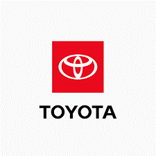
Toyota – Three Ovals, Secret Letters, and a Handshake
Once upon a time, a car company wanted a logo that looked sleek, modern, and timeless but also had a secret for anyone curious enough to notice. Enter Toyota’s badge: three overlapping ovals that, at first glance, seem simple and elegant. But look closer, and you’ll discover the magic every letter of “Toyota” is hiding in those ovals, like a puzzle waiting to be solved.
And the story doesn’t stop there. The two inner ovals? They aren’t just decorative; they represent the bond between Toyota and its customers, a silent handshake promising trust, reliability, and care. Launched in 1989, this emblem quietly tells a story every time it glints in the sun on the hood of a car: innovation, connection, and a touch of clever mischief.
So next time you see a Toyota rolling by, remember: behind that simple, stylish logo is a little secret game, a promise to drivers, and a reminder that even shapes can tell a story.


