In the world of branding, colour is far more than an aesthetic choice, it is a psychological trigger. Marketing research shows that consumers form impressions about a brand within seconds, and a large portion of those judgments are influenced purely by colour. Studies suggest that 62–90% of a consumer’s first impression of a product is based on colour alone, while consistent use of a signature colour can increase brand recognition by up to 80%.
This is why the most powerful brands treat colour as a strategic asset rather than just a design element. Colours communicate emotions instantly: red can trigger excitement and urgency, blue builds trust and reliability, while black signals luxury and authority. These emotional cues operate almost subconsciously, shaping how consumers perceive a brand before they even read its name or understand its product.
Over time, consistent colour usage turns a shade into a symbol. When people see a particular colour repeatedly across packaging, advertising, and digital platforms, the brain begins to link that colour directly to the brand. Eventually, the colour alone becomes enough for recognition — whether it’s a red can on a supermarket shelf or a blue social media interface on a smartphone. Some brands have mastered this so well that their colours are now inseparable from their identity.
Here are five brands that turned colours into powerful marketing assets.
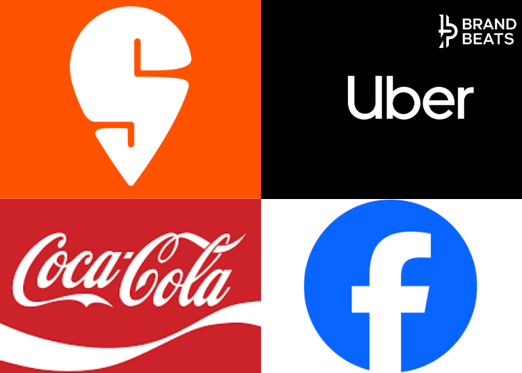
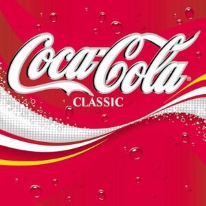
1. Coca-Cola — Red
Few brands have owned a colour as completely as Coca-Cola owns red. As per reports the association dates back to the late 19th century when the company painted its syrup barrels red to differentiate them from alcohol shipments during transport. Over time, the colour became deeply embedded in the brand’s identity.
From a psychological perspective, red is the perfect colour for a beverage brand. It represents energy, excitement, passion, and action, and it also stimulates appetite and impulse decisions which is why it is widely used in the food and beverage industry.
Coca-Cola amplified this association through consistent use across packaging, advertising, vending machines, and global campaigns. Today, the brand’s signature red is so powerful that a simple red background with a curved white line can instantly evoke Coca-Cola in the minds of consumers worldwide.
2. Swiggy — Orange
Swiggy’s vibrant orange identity is designed to reflect the brand’s energetic and youthful personality. Orange is widely associated with friendliness, enthusiasm, and warmth, making it an ideal colour for brands that want to appear approachable and fun.
In the competitive food delivery space, visibility matters. Swiggy’s bright orange delivery bags and jackets ensure the brand stands out on crowded city streets. The colour also subtly aligns with the emotional side of food consumption warmth, comfort, and satisfaction.
By consistently using orange across its app interface, marketing campaigns, and delivery fleet, Swiggy has turned a single colour into a powerful recognition tool in India’s fast-growing digital commerce ecosystem.

3. Facebook — Blue
Blue is one of the most commonly used colours in technology and corporate branding because it communicates trust, stability, and reliability. These associations are crucial for companies that manage personal data and digital communication.
Facebook adopted blue as its dominant brand colour partly because of its universal appeal and calming effect. Unlike warmer colours that create urgency, blue conveys security and professionalism, an important signal for a platform designed to host social interactions for billions of users.
Over time, Facebook’s interface, logo, and visual identity made this particular shade of blue synonymous with social networking itself. Even a simple blue notification icon on a phone can remind users of the platform.

4. Uber — Black
Uber’s minimalist black branding reflects the company’s positioning as a premium, sophisticated mobility service. In colour psychology, black is strongly associated with power, authority, elegance, and luxury, which is why it is often used by high-end fashion and technology brands.
When Uber launched, its branding aimed to differentiate the service from traditional taxis. The sleek black interface and typography communicated a sense of modernity and exclusivity similar to the aesthetic of luxury products or high-end technology.
This design choice helped Uber position itself not just as a transportation service but as a premium urban lifestyle platform, where the experience feels seamless, modern, and elevated.
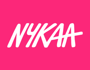
5. Nykaa — Pink
Nykaa’s black and pink colour palette perfectly reflects the brand’s positioning in the beauty and lifestyle space. Pink has long been associated with femininity, beauty, softness, and self-expression, making it a natural fit for cosmetics and personal care products.
At the same time, Nykaa pairs pink with black to create a sense of premium sophistication. The result is a brand identity that feels both glamorous and modern, appealing to India’s growing generation of digitally savvy beauty consumers.
By maintaining this colour palette across packaging, retail stores, and its online platform, Nykaa has built a visual identity that stands out instantly in the crowded beauty market.
In the attention economy, recognition is everything. Logos can evolve, taglines can change, and campaigns come and go but colours often remain constant. When used consistently and strategically, a colour can become one of a brand’s most valuable marketing assets.
From Coca-Cola’s energetic red to Facebook’s dependable blue, these brands demonstrate how a single shade can carry emotion, memory, and identity. In many cases, the colour becomes so powerful that consumers don’t even need to see the logo, the colour itself is enough to tell the story.