

Dating app Tinder has unveiled a comprehensive new brand identity, marking its first major redesign in nearly a decade. The refresh introduces a redesigned visual system, updated typography, a new tone of voice and a significant change to its iconic logo by replacing its long-standing lowercase wordmark with an all-caps version.
The rebrand, created in collaboration with design agency Porto Rocha, is intended to reposition Tinder for a new generation of users while reinforcing its status as one of the world’s most recognisable dating platforms.
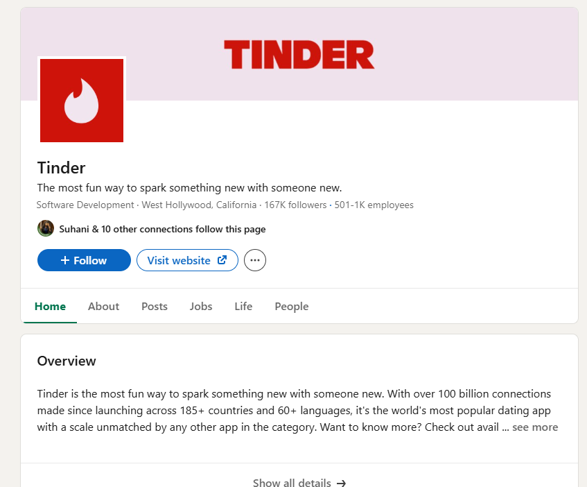
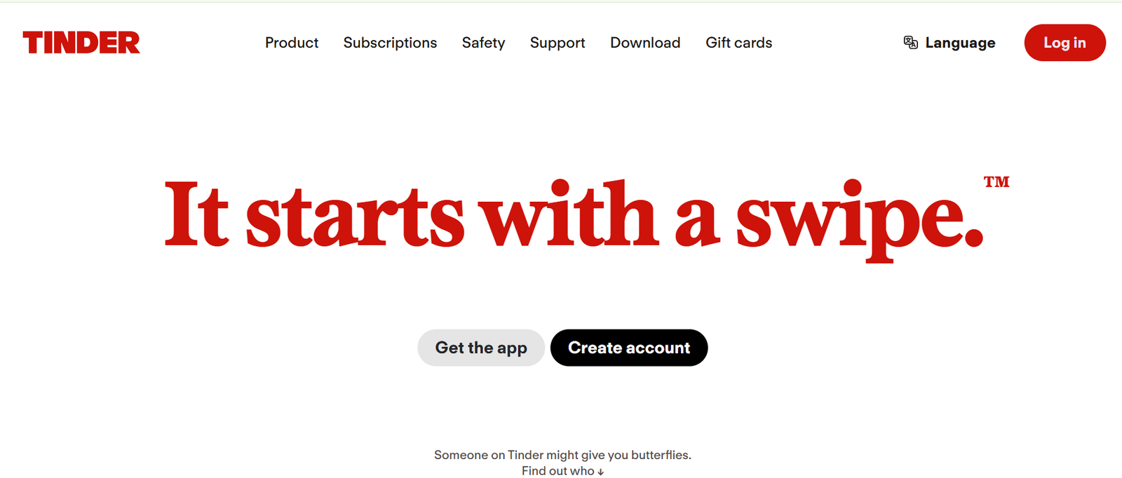
One of the most noticeable changes is the wordmark. Tinder has retired its familiar lowercase logo in favour of a bold uppercase “TINDER,” reflecting a more confident and assertive personality. The brand has also refined its signature flame icon, giving it a sleeker and sharper appearance while retaining its recognisable silhouette.
Alongside the updated logo, Tinder has introduced a new visual identity featuring a serif headline typeface paired with a modern sans-serif font. The company has also expanded its colour palette beyond its traditional warm pink and orange gradients by incorporating shades of blue and green to better capture the range of emotions associated with modern dating.
The refreshed identity extends beyond visuals. Tinder has adopted a more conversational, witty and editorial-style brand voice designed to resonate with Gen Z users. According to the design team, the rebrand reflects the contradictions of contemporary dating, where young people seek genuine connections while navigating an increasingly complex digital landscape.
Another key design element is the reinterpretation of Tinder’s signature swipe gesture. Rather than associating swiping with endless scrolling, the updated identity uses swipe-inspired animations to reveal typography, imagery and brand elements, reinforcing themes of anticipation, possibility and discovery that are central to the Tinder experience.
The updated identity has already been rolled out across Tinder’s official website and social media channels, where the new all-caps logo has replaced the brand’s longstanding lowercase wordmark.
FAQs
1. Why did Tinder change its logo?
Tinder updated its logo as part of a broader brand refresh aimed at creating a bolder, more expressive identity that better reflects modern dating culture and resonates with Gen Z users.
2. What has changed in Tinder’s new brand identity?
The redesign includes a new uppercase wordmark, a refined flame icon, updated typography, an expanded colour palette, fresh illustrations and motion design, and a more conversational brand voice.
3. Who designed Tinder’s new brand identity?
Tinder collaborated with global creative agency Porto Rocha to develop its new visual identity and branding system.
4. Has Tinder updated its logo across all platforms?
Yes. Tinder has rolled out its new branding across its official website, social media channels, and other digital touchpoints, replacing the previous lowercase logo with the new uppercase wordmark.
5. When was Tinder’s last major rebrand before this update?
Before the 2026 refresh, Tinder’s previous major brand redesign was introduced nearly a decade ago, making this one of the company’s most significant visual identity updates in recent years.