
Brands have realised that packaging is no longer the last step of manufacturing, it’s one of the first moments of marketing. Consumers don’t just buy products anymore; they buy experiences, personalities and stories. The moment a package lands at someone’s doorstep, it has the potential to become content. One good photograph, one satisfying unboxing reel or one witty line printed on a box can travel far beyond the customer who originally bought it.
For brands, this has created a new marketing opportunity. Instead of spending lakhs chasing attention online, many are designing packaging that naturally earns it. Every delivery becomes an advertisement. Every unboxing becomes user-generated content. Every share becomes free reach.
Several Indian brands have embraced this idea, turning ordinary boxes, pouches and wrappers into conversation starters. Here are six brands whose packaging has become as memorable as the products inside.
1. Comet Sneakers
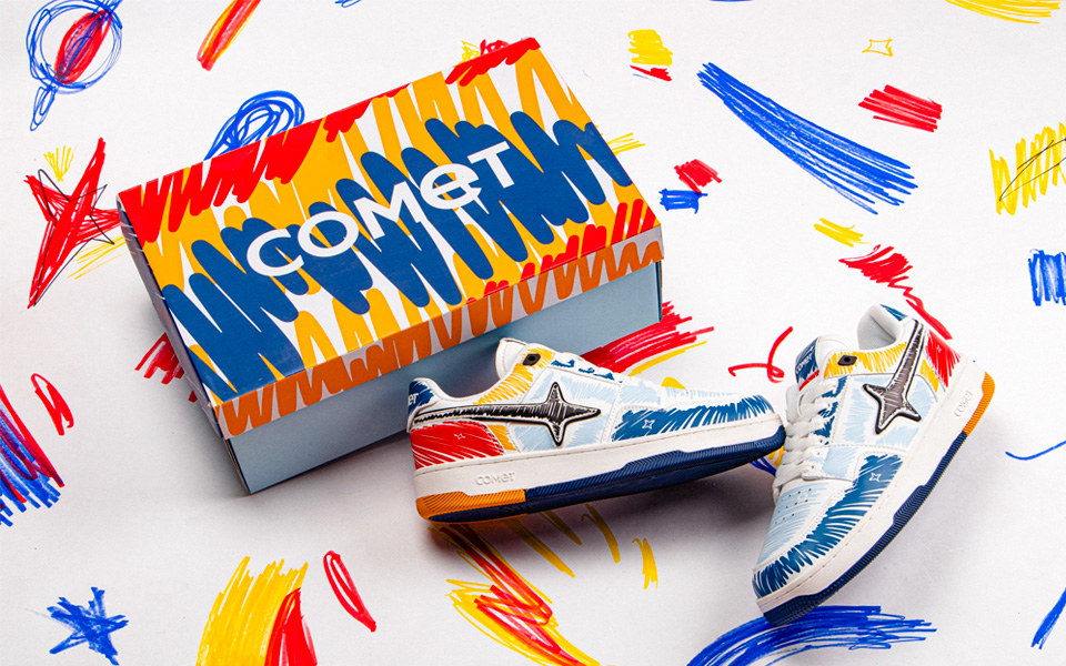
Comet didn’t launch itself as just another sneaker company—it introduced an entirely new universe. Inspired by space, motion and exploration, the brand has carried its cosmic identity into every touchpoint, especially its packaging.
Instead of treating the shoe box as disposable, Comet designed it as part of the product experience. The bold graphics, futuristic illustrations and premium finish feel like they’re opening something collected from another planet rather than a pair of sneakers. The experience begins before customers even lace up their shoes.
That attention to detail has helped Comet dominate sneaker unboxing content across Instagram, YouTube Shorts and creator communities. Fashion creators frequently feature the packaging alongside the sneakers because it visually complements the product. Rather than disappearing into the background, the box becomes part of the story.
2. NEWME
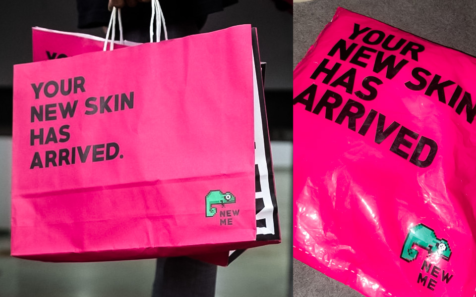
Few Indian fashion brands understand internet culture quite like NEWME. Built for digital natives, the brand’s packaging speaks the same language as its audience.
Bright pink boxes, oversized typography, quirky one-liners and playful graphics make every delivery instantly recognisable. The packaging feels less like a courier box and more like a social media prop designed to be photographed.
This isn’t accidental. NEWME understands that its customers love documenting purchases online. Instead of relying only on influencer collaborations, it created packaging people genuinely want to show in mirror selfies, unboxing reels and shopping hauls.
The result is a delivery experience that feels energetic, expressive and unmistakably Gen Z.
3. Paper Boat
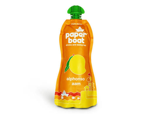
Long before “Instagrammable packaging” became a marketing buzzword, Paper Boat had already demonstrated how design could tell an emotional story.
When the brand launched, most juice brands relied on conventional cartons or plastic bottles. Paper Boat broke that pattern with its distinctive stand-up pouches featuring soft illustrations, handwritten typography and earthy colours inspired by Indian childhood memories.
Everything from the shape of the pouch to the illustrations reinforced the brand’s larger narrative around nostalgia. The packaging felt warm, familiar and deeply Indian.
Consumers didn’t just remember the drinks they remembered how they looked. The pouches became highly shareable across social media, often appearing in lifestyle photography and café tables, helping Paper Boat build recall without relying solely on traditional advertising.
4. Noice by Swiggy
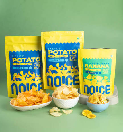
When Swiggy introduced its FMCG brand Noice, it didn’t stop at creating a catchy name. It extended that personality across every snack pack.
Bright colours, playful illustrations and cheeky copy transform ordinary grocery packaging into something people actually pause to read. The brand’s humour feels internet-native, making every packet feel like a meme waiting to happen.
The design also performs exceptionally well on quick-commerce apps where products have only a few seconds to grab attention. Even after delivery, creators frequently include Noice products in grocery hauls, desk setups and aesthetic pantry videos because the packaging stands out visually.
It’s a reminder that humour isn’t just something brands say—it can also be something they design.
5. Sugar Cosmetics
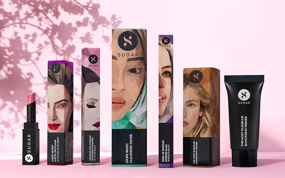
Beauty shelves are often crowded with products competing through glitter, metallic finishes and elaborate graphics. Sugar Cosmetics chose the opposite direction.
Its signature matte-black packaging paired with bold typography created an identity that feels premium without being overwhelming. The clean aesthetic immediately differentiates the brand from more traditional beauty packaging while remaining instantly recognisable.
Over the years, Sugar’s products have become staples in beauty creators’ flat lays, vanity tours and makeup tutorials. The packaging photographs beautifully, which has naturally contributed to its popularity across social media.
Rather than chasing trends, Sugar has built consistency. Whether it’s a lipstick, eyeliner or foundation, the visual language remains unmistakably Sugar.
6. SuperYou
Protein snacks have traditionally looked functional rather than exciting. SuperYou decided to challenge that perception.
Its products arrive in vibrant packs featuring bold colours, dynamic typography and energetic graphics that immediately communicate movement and flavour. The packaging reflects the brand’s youthful positioning instead of borrowing cues from traditional sports nutrition brands.
Whether it’s Protein Wafers, Multigrain Chips or the recently launched Power Puffs, SuperYou maintains a playful visual identity across its portfolio. The bold colour palette makes the products highly visible both on retail shelves and quick-commerce platforms, where first impressions often determine purchase decisions.
The result is packaging that feels less like health food and more like something consumers are genuinely excited to pick up and photograph.

Today’s best packaging isn’t just functional, it has become a marketing channel in its own right. For brands, every delivery box, pouch or wrapper is another chance to create recall, spark conversations and encourage user-generated content.
As social commerce, quick commerce and creator culture continue to grow, packaging is evolving from an operational necessity into a strategic branding tool. The brands winning this game aren’t simply designing products that look good on shelves, they’re designing products that people voluntarily feature in their feeds.
In an era where every customer is also a potential creator, the most successful packaging doesn’t end its journey at the doorstep. That’s where its marketing begins.