

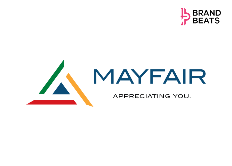
Mayfair Housing is giving its brand identity a contemporary makeover as the 62-year-old Mumbai-based real estate company enters a new phase of growth.
The refreshed identity includes a simplified logo, a new wordmark and a more unified visual system across its communication, digital platforms, advertising, sales offices and other customer touchpoints. The idea is to make the brand easier to recognise and more consistent without moving too far away from what existing customers already associate with Mayfair Housing.
The timing also reflects a shift in the company’s business. As Mayfair Housing expands across key micro-markets in the Mumbai Metropolitan Region and Ahmedabad, it is also looking to connect with a newer generation of homebuyers. The new identity is intended to reflect that contemporary audience while retaining the trust and credibility the company has built over six decades.
At the centre of the redesign is a geometric symbol inspired by a moving pinwheel. Its three directional elements represent evolution, balance and growth, while retaining the triangular character associated with the existing Mayfair Housing identity.
The redesign also keeps the brand’s familiar red, green, orange and blue colour palette, but uses it through a more structured visual system. The new symbol sits alongside a contemporary wordmark and the brand promise, ‘Appreciating You.’
The thinking behind the redesign revolves around two ideas: the wheel of time and the winds of change. The former reflects how customer expectations and generations evolve, while the latter represents the need for a brand to adapt and keep moving forward.
For Mayfair Housing, the refresh is therefore less about replacing its identity and more about updating how that identity shows up. Recognisable elements have been retained, while the overall system has been made more flexible for digital, print and physical spaces.
The new identity comes as the company looks to carry its six-decade legacy into its next phase, balancing familiarity with a visual language designed for how customers interact with real estate brands today.
Commenting on the new brand identity, Dr Nayan Arvind Shah, Chairman, Mayfair Housing, said, “Any brand that has endured for more than six decades needs to stay rooted in its values while it responds to the world around it. For Mayfair, we are bringing in transformation that carries forward the trust, responsibility and commitment on which we were built. Being in the present gives our legacy a clear, contemporary expression without changing the principles that guide us in how we create homes, serve customers and build long-term relationships.”
“Its simpler and more contemporary form gives us greater clarity and consistency across every touchpoint, while ‘Appreciating You.’ continues to remain at the heart of everything we do. It reflects Mayfair Housing as a brand that is relevant, recognizable and ready for the future,” he said.
Aditya Nayan Shah, Joint Managing Director, Mayfair Housing, said, “Our refreshed identity marks an important step in Mayfair’s evolution and reflects the future we are building as a brand. Designed for a dynamic and increasingly connected world, it embodies our commitment to staying relevant, progressive, and customer-centric across every touchpoint. While its refined form brings greater clarity, consistency, and versatility, our core philosophy, ‘Appreciating You.’, remains unchanged and continues to guide everything we do.”
He added, “More than a visual transformation, this identity represents our ambition to grow, innovate, and create lasting value for our customers, partners, and communities. It is a symbol of a future-ready Mayfair: confident in its legacy, inspired by new possibilities, and prepared for the next chapter of growth.”
Anay Nayan Shah, Joint Managing Director, Mayfair Housing, added, “Our new brand identity reflects Mayfair Housing’s vision for the future while building on the strength of the legacy we have created over the years. As we enter a new phase of growth, this evolution positions us to engage more meaningfully with a changing world, a new generation of homebuyers, and emerging opportunities across the real estate landscape.”
He further added, “More than a visual transformation, it is a reaffirmation of our commitment to innovation, excellence, and customer-centricity. It represents Mayfair Housing as a progressive, future-ready organization that continues to create enduring value for its customers, partners, and communities, while staying true to the principles that have defined us from the very beginning.”