

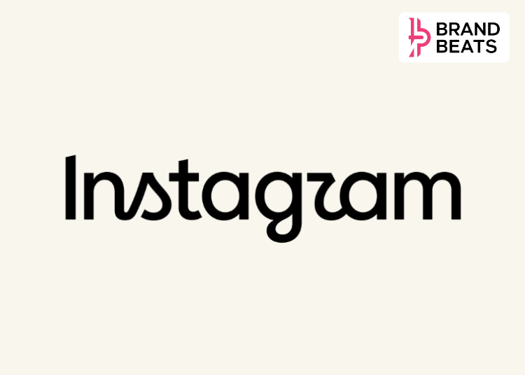
Instagram has refreshed one of the most recognisable parts of its visual identity for the first time in nearly a decade. The Meta-owned platform has introduced a redesigned wordmark, the text-only version of the Instagram logo while keeping its familiar camera icon unchanged.
The update was announced by Instagram head Adam Mosseri on Instagram and Threads on August 13. Mosseri described the new wordmark as “sharper and more modern”, while saying it still references Instagram’s original design and retains the simplicity associated with the brand.
View this post on Instagram
The previous wordmark, introduced as part of Instagram’s 2016 visual refresh, used a more traditional cursive style.
The new version takes a hybrid approach, combining cursive and print-inspired elements. The most noticeable changes appear in letters such as “s”, “r” and “g”, which have been redrawn with sharper curves and more distinctive forms.
Instagram has also refreshed elements of its wider typography system, including typefaces such as Instagram Sans, Instagram Pen and Instagram Mono, as part of the broader identity update.
The colourful camera icon that users associate with Instagram, however, has not been replaced. The change is specifically focused on the wordmark rather than the app icon.
Instagram’s previous wordmark had been in use for about ten years. According to Mosseri, the design had begun to feel dated, prompting the company to give it a refresh rather than completely replace the visual language.
The approach is relatively restrained. Instead of moving away from the recognisable Instagram aesthetic, the platform has retained the cursive influence while making the lettering more contemporary. The change also comes as Instagram continues to evolve beyond its original photo-sharing identity, with Reels, creators, messaging and other content formats now central to the platform.
The redesign has already generated plenty of discussion online.
While some users have welcomed the fresher look, others have questioned the readability of certain letters, particularly the “r”, which some users say resembles a “z”. This has led to jokes about the platform being called “Instagzam”.
The reaction highlights one of the biggest challenges in updating an established brand identity: even small changes to familiar visual elements can become highly noticeable when the brand is used by billions of people.
FAQs
- What has changed in Instagram’s logo?
Instagram has redesigned its text-based wordmark, while keeping its familiar colourful camera icon unchanged. - When was Instagram’s wordmark last redesigned?
The previous major Instagram identity update was introduced in 2016. The latest wordmark refresh comes nearly a decade later. - Has Instagram changed its camera icon?
No. The latest update focuses on the wordmark; the recognisable Instagram camera icon remains unchanged. - Why did Instagram redesign its wordmark?
Instagram head Adam Mosseri said the previous wordmark had become dated, and the new version is intended to look sharper and more modern while retaining elements of the original design. - What are people saying about Instagram’s new wordmark?
Reactions have been mixed. While some users like the refreshed design, others have criticised the readability of certain letters, particularly the “r”.